

- Free Article: No
- Contents Category: Art
- Custom Article Title: Radical Utopia: An archeology of a creative city
- Review Article: Yes
- Article Title: Radical Utopia: An archeology of a creative city
- Article Subtitle: An excess of post-modern Melbourne design
- Online Only: No
- Custom Highlight Text:
Radical Utopia: An archeology of a creative city, curated by Harriet Edquist and Helen Stuckey, is a maximalist experience. Even the title itself is a little unwieldy.
- Article Hero Image (920px wide):
.jpg)
- Article Hero Image Caption: Prints by Carole Wilson, Arabic Women's Group (photograph by Tobias Titz)
- Alt Tag (Article Hero Image): Prints by Carole Wilson, Arabic Women's Group (photograph by Tobias Titz)
- Production Company: RMIT Gallery
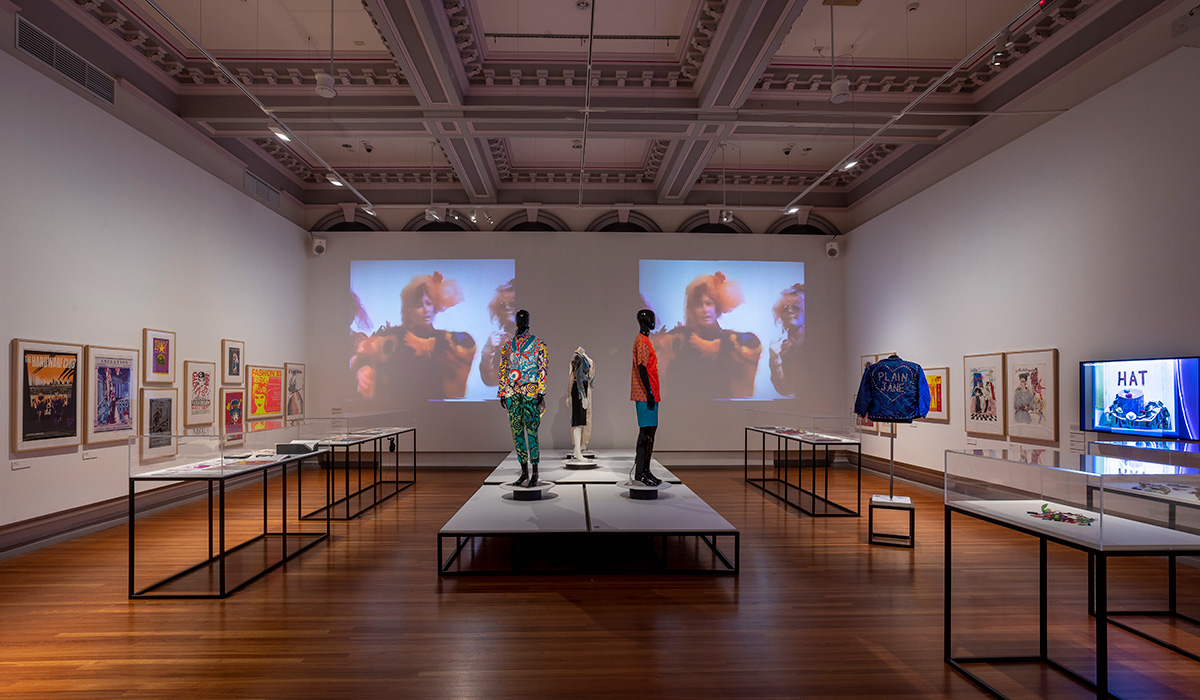
This excessiveness seems appropriate for the main gallery space, which is concerned with the constellation of designers and fashion events associated with the Fashion Design Council of Australia. The FDC was initially formed in 1983 by the trio of Robert Pearce, Kate Durham, and Robert Buckingham. Their original intent was simply to document a series of underground fashion events staged at the iconic punk venue The Seaview Ballroom. The group became crucial in promoting a local, uncompromisingly independent fashion culture through multiple events and later a retail store in the city. Their avant-garde spirit certainly feels like a precursor to more recent art/fashion retail-exhibition hybrids in Melbourne such as Centre d’Edition, Centre for Style, and Y3K.
 Installation Image, Gallery 1 (photograph by Tobias Titz)
The FDC’s numerous runway events are amply illustrated through posters and runway videos with blaring, period dance-music soundtracks. These events were huge spectaculars, overflowing with young designers. There was an anarchic spirit in their initial vision, and they provided a platform not only for professionals and students but also punk-era amateurs. The early runway shows saw junk-assemblage and backyard screen-printing on equal footing with more traditional (albeit daring or experimental) couture approaches.
Nightclubs such as Metro and Inflation were often used as venues for FDC fashion events. The interiors of these clubs were designed by FDC associates Biltmoderne, an architecture and design trio of Dale Jones, Randal Marsh, and Roger Wood. Biltmoderne’s work for these clubs is captured in the vibrant and glowing nightclub photography of John Gollings. They portray the industrial theatre of the Metro nightclub in the glossy high focus of the fashion editorial. (It is somewhat annoying that they are partly hidden behind the display of funky, angular night club furniture designed by the group.) Gollings zooms out and focuses on the personality of the nightclub itself, all exposed metal, dominating flood lights, disorientating tile work, and zig-zagging strip of geometric neon lighting. The photographs provide an interesting contrast to the humanism of Rennie Ellis’s party-verité photography that has become a common representation of the period. The crowd is here rendered as a ghostly phantom or a swirling, vibrating mass.
FDC’s Robert Pearce, a central figure in the exhibition, is one of the few designers whose presence threads through the various rooms. Pearce, a tireless promoter of fashion as an ethos, seems to have been concerned with notions of visibility. This was in one sense around sexual politics, his art and illustration work being overtly and unashamedly gay, one example of the increasingly assertive public identity of gay culture in Australia by the late 1970s. Pearce’s concern with visibility should not be narrowly confined to simply being a form of identity politics. Pearce advocated a most contemporary notion of individuality as style and exhibitionism. In an interview from 1981 he bemoaned the ‘Aussie dressing down, scared to be noticed’ attitude; his broader concern was with style and fashion as a form of self-visibility.
Pearce’s illustrative works are amply displayed throughout the show, and his angular style recalls both punky West Coast art-comics (e.g. Gary Panter and Raw) and contemporary Japanese new-wave illustration. Cartoonish leather-daddy figures populate much of Pearce’s work, their typically gruff character rendered droll in his comic approach. Pearce’s series of illustrations for the architecture firm Edmond & Corrigan from 1980 are especially hilarious and deeply strange as a form of promotion. His renderings of their architectural commissions for churches, schools, houses, even the Stockman’s Hall of Fame, are populated with alienated children, hip priests, and weathered but hunky stockman. In the case of the design for Barber House in Carlton, Pearce adds a parade of inner city ‘trendies’ – a sharply dressed ‘new wave’ woman, a leather daddy, and a duffel-coated academic. It is one of the works here that speaks most to the present.
 Works by Lyn Tune, Sally Pryor, Ashley Crawford (photograph by Tobias Titz)
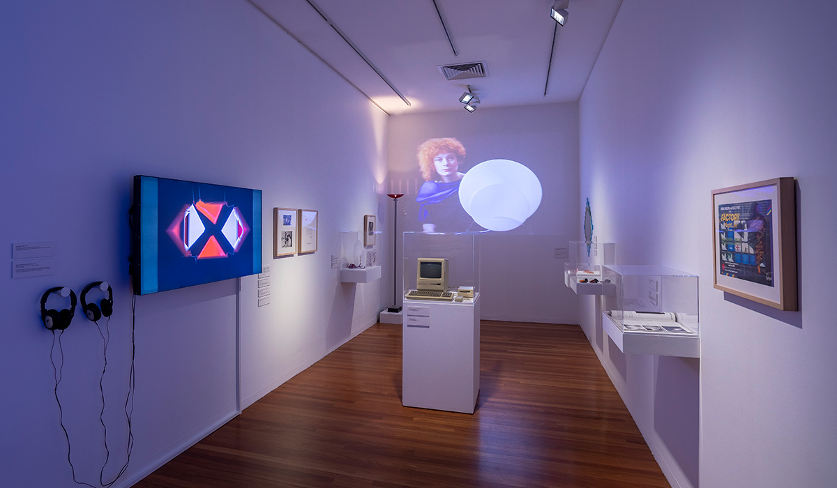
The room dedicated to digital design, one of the more intriguing avenues here, feels curtailed. Lyn Tune’s neo-art deco jewelry and furniture – produced through computer-assisted design – is crammed alongside a small display on Jean-Marc Le Pechoux’s digital animation company Video Paint Brush (who later morphed into Animal Logic, which has worked on numerous blockbusters including Happy Feet and Harry Potter). While early on Video Paint Brush collaborated with artists including Pearce and the video art duo of Robert Randall and Frank Bendinelli, the curators have opted to only include only brief examples of the company’s commercial work, such as a Hong Kong Bank advertisement animated by Sally Pryor.
The connected section on computer game design groups Beam Software and Melbourne House feels a bit muted. The few screens of video games and the selection of old game packages merely highlight these groups’ existence rather than provide insight into the context of their production (though a quote from one game designer suggests that perhaps the problem was that there was no context for this work.)
Strangely, the architecture section is the one section in this exhibition feels the least solid. This is due to the curators’ focus on the discursive turn of the 1980s rather than on any final built forms. Perhaps this was deemed unnecessary given that the RMIT Gallery is wedged between two of the most dramatic examples of post-modern architecture in the CBD: Edmond & Corrigan's RMIT Building 8 and Ashton Raggatt McDougall’s still confronting Storey Hall.
Given that the theme is architecture conferences and exhibitions, the room is mostly exhibition posters, vitrines of ephemera, and a slideshow. Apart from the architectural models for Gregory Burgess’s Engehurst house from 1980 and Kevin Borland’s Nichols House, Eltham from 1973, there is little indication of the built outcomes from these extensive theoretical discussions and experiments. The inclusion of Borland’s 1973 architectural model also points to some of the problems of the exhibition. There is no explanation for its inclusion beyond an earlier inclusion in the exhibition Home Sweet Home: Changes in Victorian domestic architecture 1939 – 1989. It seems out of place within the overall curatorial emphasis on the 1980s as a moment of a post-modernist break, especially given that Borland emerged professionally at least two generations prior in the 1940s.
At times, the intergenerational continuity with the 1960s and 1970s feels more evident in the show than any connections with contemporary Melbourne. This is the certainly the case in the final room of the exhibition, which is dedicated to politically orientated printing collectives. Little seems to separate these groups from similar collectives in the 1960s and 1970s, beyond the day-glo colour schemes and political issues (e.g. the HIV/AIDS epidemic and Indigenous sovereignty). Collectives such as Jillposters, Another Planet Posters, Backyard Press, and All Australian Graffiti (these last two groups forming in the mid-1970s), seem less like the beginning than the end of a tradition. They represent not so much an archeology of contemporary design culture in Melbourne but rather artefacts of the long twentieth century. These poster groups are instead emblematic of the wider ideological schisms and contestations between social collectivism and liberal individualism of the period, a schism that was seemingly ended, albeit temporarily, with the end of the Cold War.
It could be said the curators have chosen a post-modern approach to the exhibition. Their all-encompassing approach is one that equalises different forms of radicalism and utopianism; from aesthetics, design processes, to political outlook. Yet this framing feels too stretched and flattening. I was left wondering what is really shared between these poster-producing activists and the Video Paintbrush Company’s TV advertisement for Hong Kong Bank. How do they both share a ‘creative city’? While the show is highly enjoyable and informative as an overview of design trends in 1980s Melbourne, it struggles to meet the ambitious scope proposed in its rather lengthy title.
Radical Utopia: An archeology of a creative city continues at RMIT Gallery until 27 May 2023.